
See what it looks like
Real screens of the demo. Click to enlarge.
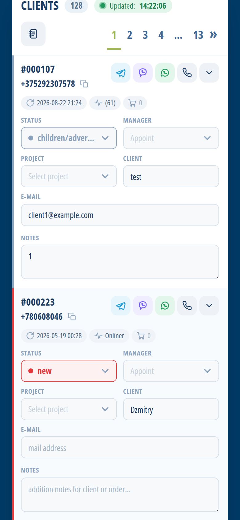
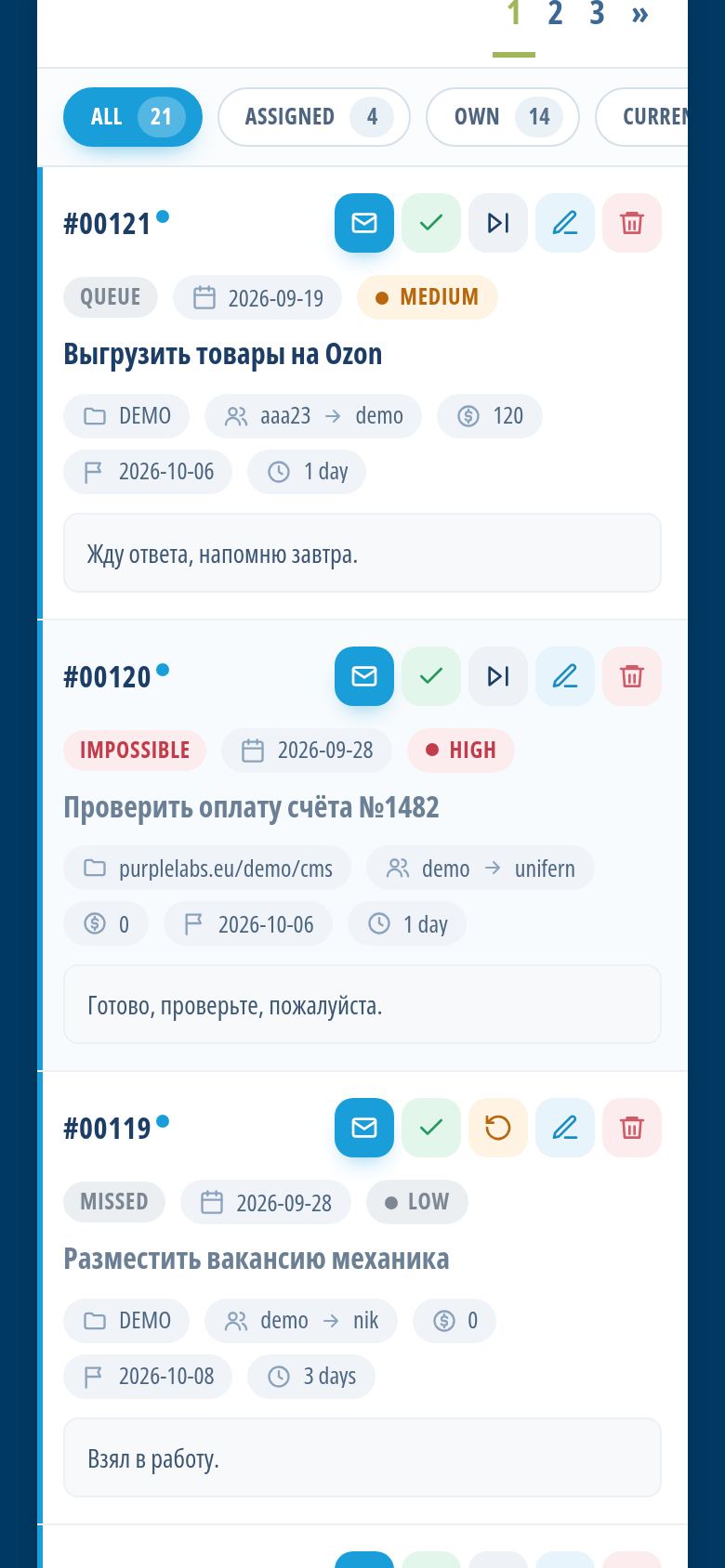
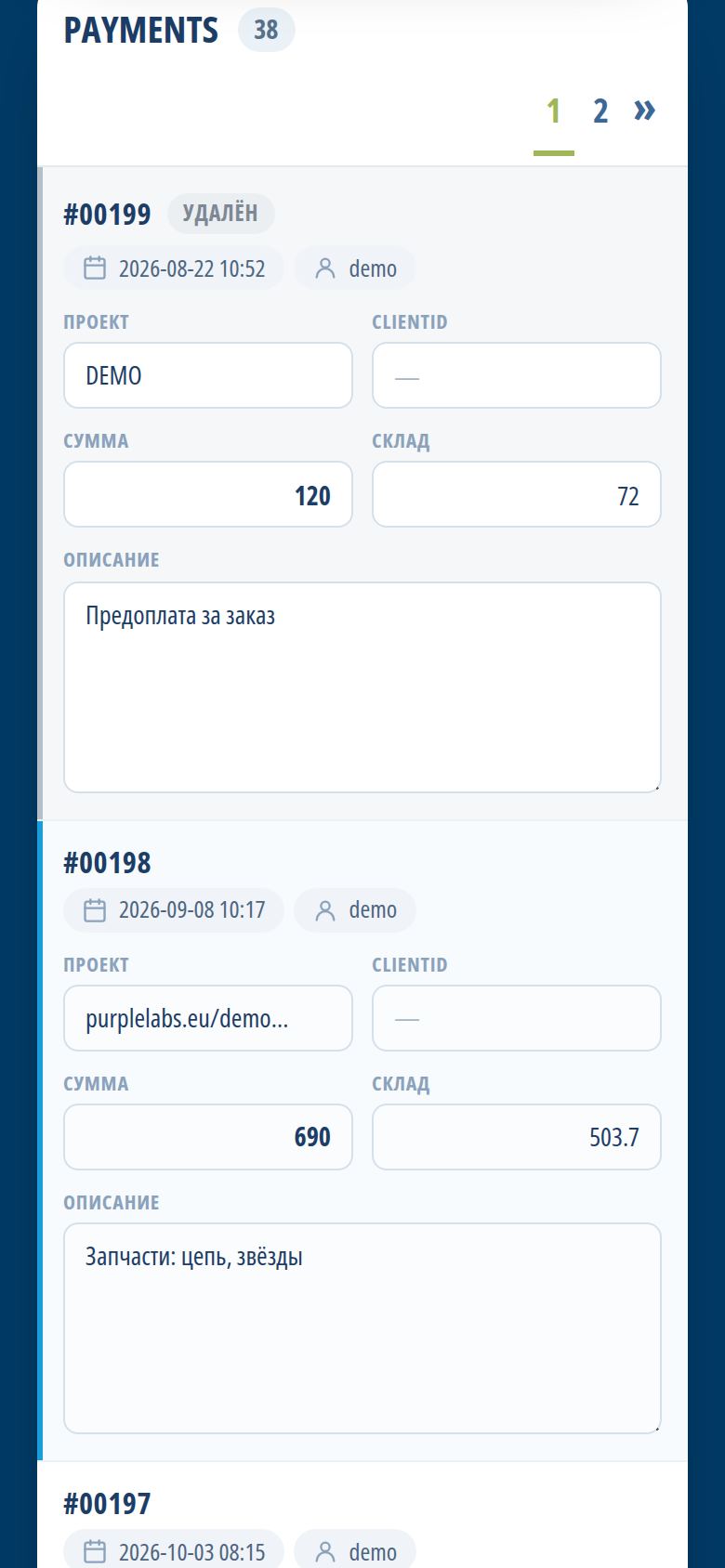
And on the phone, too
Every section is redesigned for a mobile screen: big buttons, filters in one row, calling a client with one tap.
How the BoosterCRM interface looks and why it is easy to use
An interface designed for everyday work
A CRM is a tool people open dozens of times a day, so every extra click matters. The BoosterCRM interface was built around the actions small business teams repeat most often: finding a client, logging a call, creating a task, moving a shipment to the next step or checking today’s sales. The screens are clean and calm, without decorative clutter, and the most important information is always at the top.
Because BoosterCRM is a web application, the interface looks the same in any modern browser on Windows, macOS, Linux, Android or iOS. There is nothing to install or update — when new features appear, every employee sees them the next time they open the page.
How the screens are organised
The main menu lists the modules you have access to: clients and leads, tasks, recurring jobs, calendar, sales, shipments, payments, warehouse, reports and others. Administrators can hide sections for specific employees, so a warehouse worker sees stock and shipments, while a sales manager sees clients, calls and orders. This keeps the menu short and focused for each person.
Most modules follow the same pattern, which makes the system easy to learn:
- A list with filters and tabs at the top — for example, missed or unsigned clients, or tasks assigned to you, your own tasks, current and unread;
- Statuses and counters that show how many records are at each stage, such as request, assembly, delivery and shipped in the shipment pipeline;
- A detailed card with all fields, notes, history, comments and attachments;
- Quick actions right next to the data — call back reminders, opening a messenger, copying a number or turning a recurring job into a task.
Once an employee understands one section, the others feel familiar straight away.
Filters and tabs remember the logic of the work rather than the logic of the database. A manager does not have to build complex queries: the typical questions — who has not been called back, which tasks are overdue, what is waiting for assembly — are answered by ready-made views.
The client card
The client card is the screen managers use most. It brings together the lead and client status, the responsible manager, the project, notes and the full history. The call log shows incoming, outgoing and missed calls directly in the card. Buttons for Telegram, Viber and WhatsApp open a chat in one click, and a copy button puts the phone number on the clipboard. Reminders to call back in a day, a week or a month are set with a single tap. New calls appear in the list without reloading the page, so the manager always sees fresh inquiries.
Desktop and mobile versions
On a large monitor BoosterCRM uses the space to show wide tables, several columns of data and the calendar in month or week view. This is convenient for the owner reviewing reports, an accountant checking payments and margin, or a manager processing a long list of leads.
On a phone or tablet every section switches to a mobile-optimised layout. Tables become readable cards, buttons are large enough to tap with a thumb, and the menu collapses so it does not take up the screen. A technician can open a recurring job on site, a courier can update a shipment, and a manager can call a client and leave a note while away from the office. There is no separate mobile app to install — the same address works everywhere.
The tablet view sits between the two: it keeps more information on the screen than a phone, while remaining comfortable for touch. Many teams use tablets at the counter of a shop or in the warehouse, where a full computer would be inconvenient.
Colours, statuses and visual cues
BoosterCRM uses colour to help you notice what needs attention. Recurring jobs that are due are highlighted, and overdue ones are marked by colour. Calendar events are coloured by type, task statuses — queue, in progress, review and done — are visually distinct, and counters on pipeline steps show where work is piling up. These small cues mean you can understand the state of the business at a glance, without reading every row.
Usability for the whole team
A good interface is one that people use without being forced. BoosterCRM supports this in several ways:
- Personal language. Each employee chooses English, Russian or Polish for their own interface.
- Only relevant sections. Access to projects and menu items is configured per employee, so nobody is overwhelmed.
- Consistent layout. Lists, filters and cards work the same way in every module.
- Try before you decide. The demo account with login demo and password demo lets you explore every screen without registration.
The best way to judge an interface is to use it. Open the demo, click through the client cards, tasks and shipments on your computer and then on your phone, and see how quickly your team could feel at home.
Try it right now
The demo opens in a second — no sign-up, no card, no sales calls.